2024
Clippet
Turning a messy creative workflow into a product that could scale.
Role
UI/UX Designer
Timeline
2024
Deliverables
Website + Admin Panel
Platform
Web
Clippet is a marketplace for creative services, offering 150+ solutions across branding, UI/UX, packaging and digital content.
But behind all those services was a messy workflow.
Clients, designers and internal teams were coordinating through emails and messaging apps. Orders were difficult to track, revisions got scattered, and managing multiple projects became harder as the business grew.
My job was to turn that process into a product.
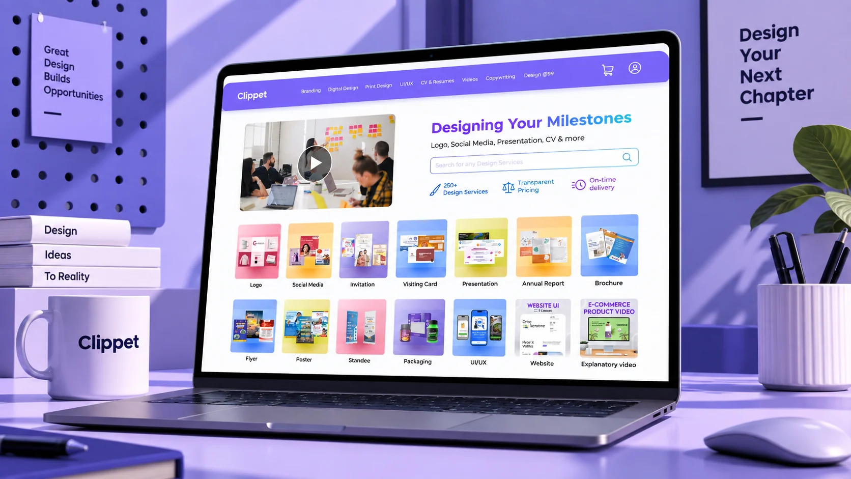
01 — The hook
Turning a messy creative workflow into a product that could scale.
Clients
Designers
150+ services
One product
Clippet already had the services, the clients and the creative team.
What it didn't have was a simple way to keep all three moving together.
The challenge wasn't just designing an interface.
It was designing a system that could keep creative work moving.
02 — The problem
The problem wasn't the number of orders. It was everything happening between them.
Client
Designer
Internal team
Spreadsheet
Back to client
…and round again for every revision
Clippet's workflow depended heavily on manual coordination.
A client might communicate in one place.A designer might receive an assignment somewhere else.A revision could get buried in a conversation.
And as the number of orders grew, keeping track of everything became increasingly difficult.
The business didn't need another communication channel.
It needed a system.
03 — The shift
So we stopped thinking like an agency. And started thinking like a product.
Agency mindset
Design the screens
Product mindset
Design the lifecycle
Instead of designing screens first, I looked at the entire order lifecycle.
- Discover
- Order
- Assign
- Work
- Review
- Revise
- Deliver
The goal was to bring these scattered moments into one connected experience.
We took the familiarity of an e-commerce journey and adapted it for creative work.
That meant clients could understand:
- What did I order?
- What's happening now?
- Who is working on it?
- What do I need to do next?
Without having to chase someone for an update.
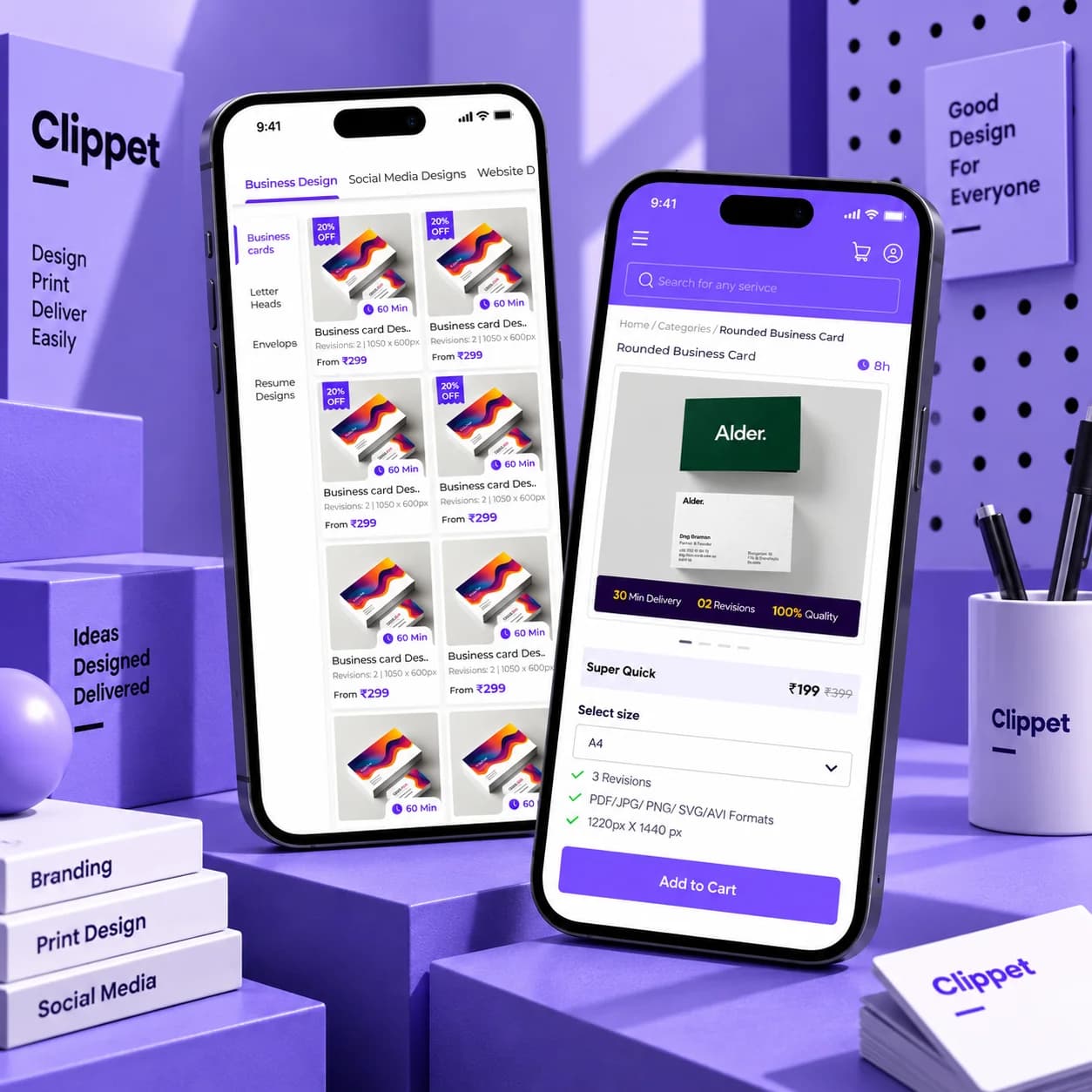
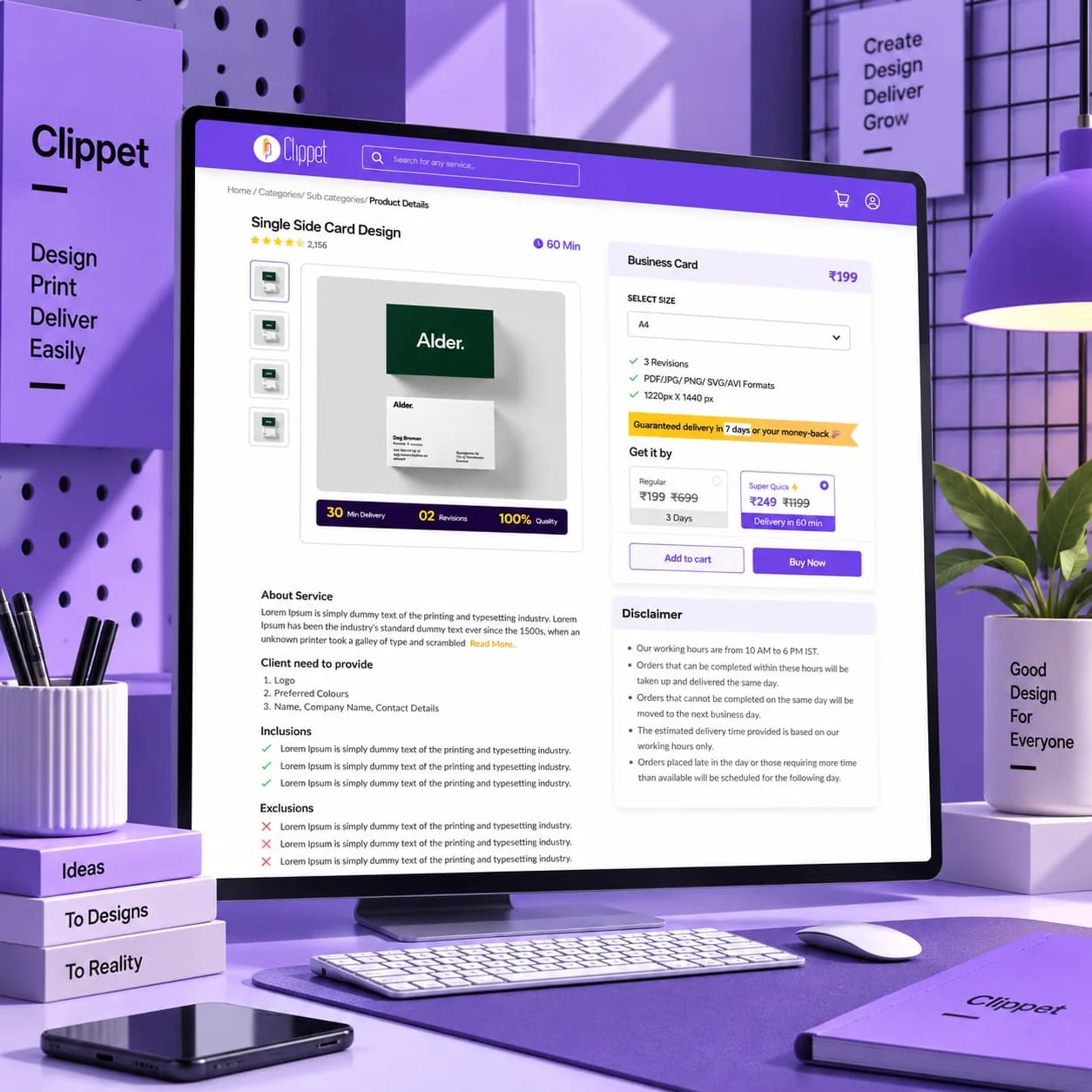
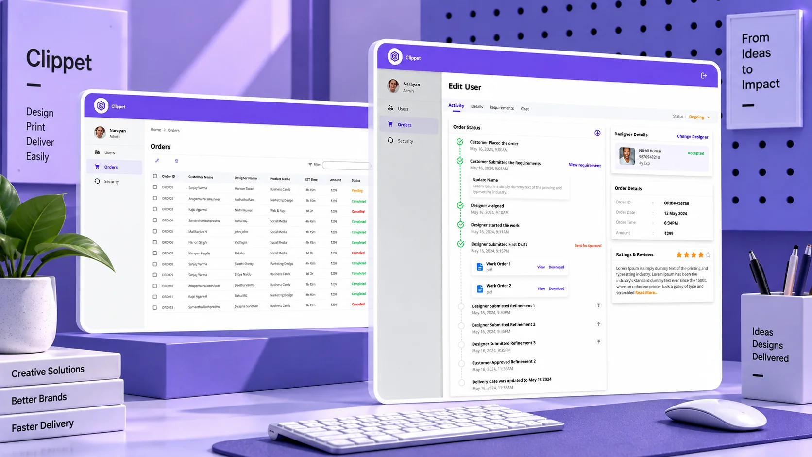
04 — The system
The dashboard became the control room.
Active orders
What's happening?
Progress
How far along is it?
Communication
What's being discussed?
Next step
What needs attention?
The dashboard wasn't just another home screen.
It became the place where the entire operation came together.
Active orders.Progress.Updates.Communication.Next steps.
Instead of making users search for what's happening, we brought the important information to them.
The interface wasn't there to show more information.
It was there to make the work easier to follow.
05 — The decision
But there was another problem. Who should work on each order?
New order
Self select
Designer picks the work
Auto assign
By workload and expertise
Design work
As orders increased, assigning every task manually would simply recreate the same problem somewhere else.
So we designed a flexible task-allocation system.
Designers could pick work themselves when they wanted to.
Or receive assignments automatically based on workload and expertise.
This gave the team flexibility without turning every assignment into another manual coordination task.
06 — The trade-off
We weren't trying to remove the humans. We were removing the unnecessary chasing.
Humans
- Creative decisions
- Feedback
- Collaboration
- Approvals
System
- Assignment
- Status tracking
- Notifications
- Order management
Creative work still needs people.
Designers need to collaborate.Clients need to give feedback.Teams need to make decisions.
The goal wasn't to automate those relationships.
It was to automate everything around them that was slowing them down.
We weren't replacing the creative process.
We were giving it a better place to happen.
07 — The result
From scattered conversations to one workflow.
The redesigned system brought ordering, tracking, collaboration and delivery into one place.
The reported impact:
50%
faster delivery
6 days → 3 days average project duration.
70%
less manual work
Through automated order handling and progress tracking.
3×
more user engagement
With collaboration built directly into the product.
30%
higher order completion
With fewer delays and drop-offs.
4.8 / 5
user satisfaction
Measured during the first 90 days.
50+
simultaneous orders
Supported without performance issues.
08 — The reflection
The interesting part wasn't the dashboard. It was changing how the business worked.
Clippet started as a service that depended heavily on manual coordination.
The redesign turned that service into a structured product ecosystem.
For me, the biggest takeaway was simple:
Good UX isn't always about making a screen easier to use.
Sometimes it's about looking behind the screen and asking:
Why does this experience have to work this way in the first place?
That question changed the direction of Clippet.
Comment
Suhail
Throw me the messy one. Those are the good ones.