2025
Flyden Holidays
Designing one travel ecosystem for people who don't travel the same way.
Role
UI/UX Designer
Year
2025
Deliverables
Web · Mobile · Admin
Platform
Web and mobile
Flyden Holidays is a multi-role travel platform built for individual travellers, travel agents, corporate teams and internal admins.
The challenge wasn't simply putting flights and hotels into one product.
It was creating an experience that could support different people, different responsibilities and different ways of booking travel without making the product feel overwhelming.
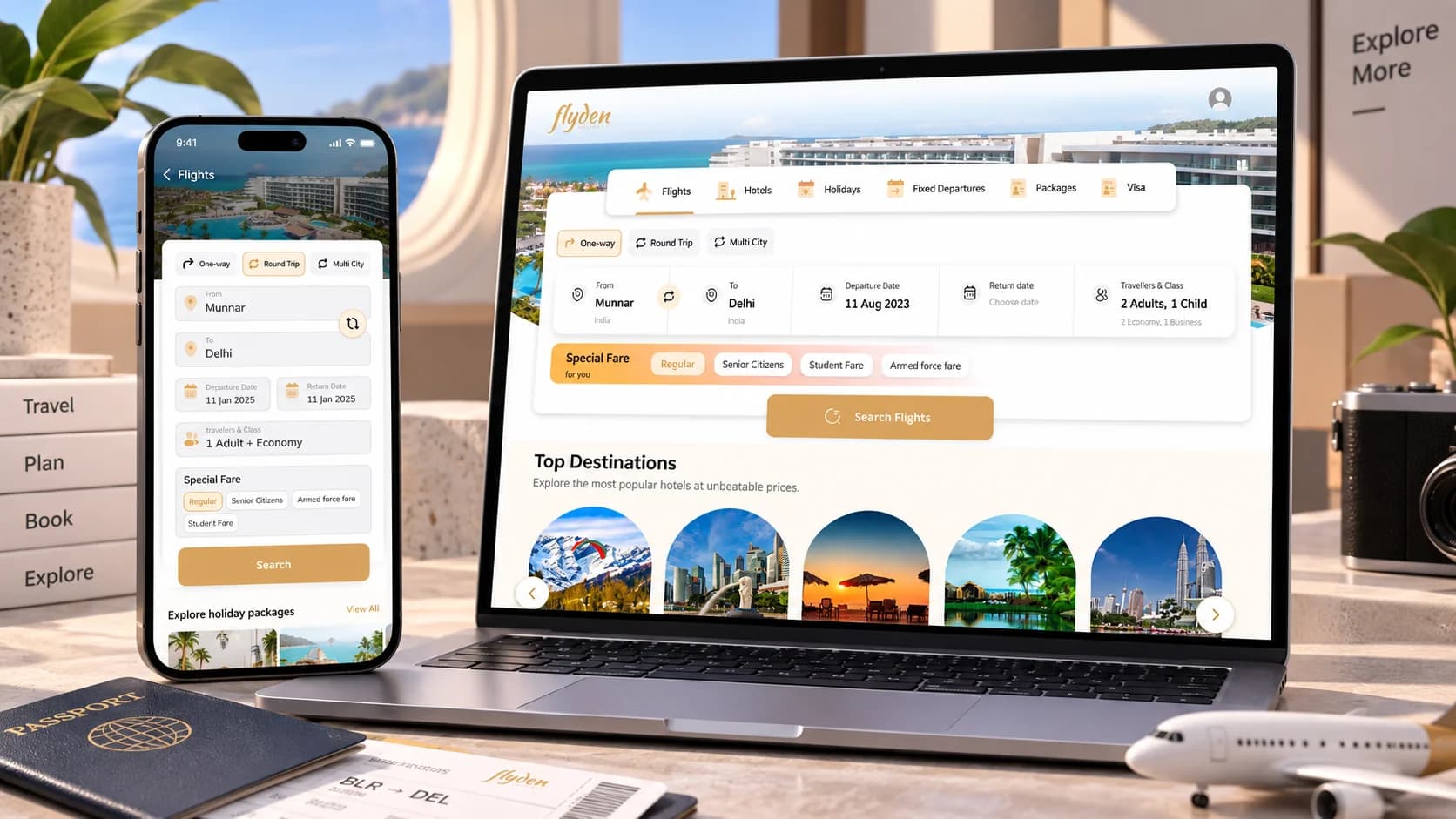
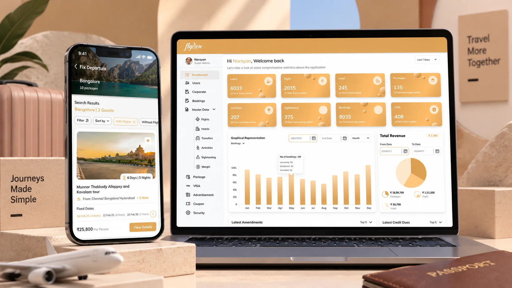
I worked across the web application, mobile application and admin panel, designing role-based booking and operational workflows.
01 — The hook
One travel platform. Four very different ways to use it.
Flyden
Traveller
Book it quickly
Agent
Book for others
Corporate
Book to policy
Admin team
Runs the operation
Travel doesn't look the same for everyone.
A traveller wants to find a flight or hotel and book it quickly.A travel agent needs more control over the booking process.A corporate team has different requirements again.And behind all of them is an internal team managing the operation.
Flyden needed to bring these experiences together without making every user navigate the same complexity.
One ecosystem. Different needs.
02 — The problem
Travel wasn't one workflow. It depended on who was booking.
Travel
Flights
Search · Select · Book
Hotels
Search · Details · Book
Holidays
Explore · Packages · Book
Booking
Operations
the complexity was unavoidable — the confusion wasn’t
A travel platform can quickly become complicated.
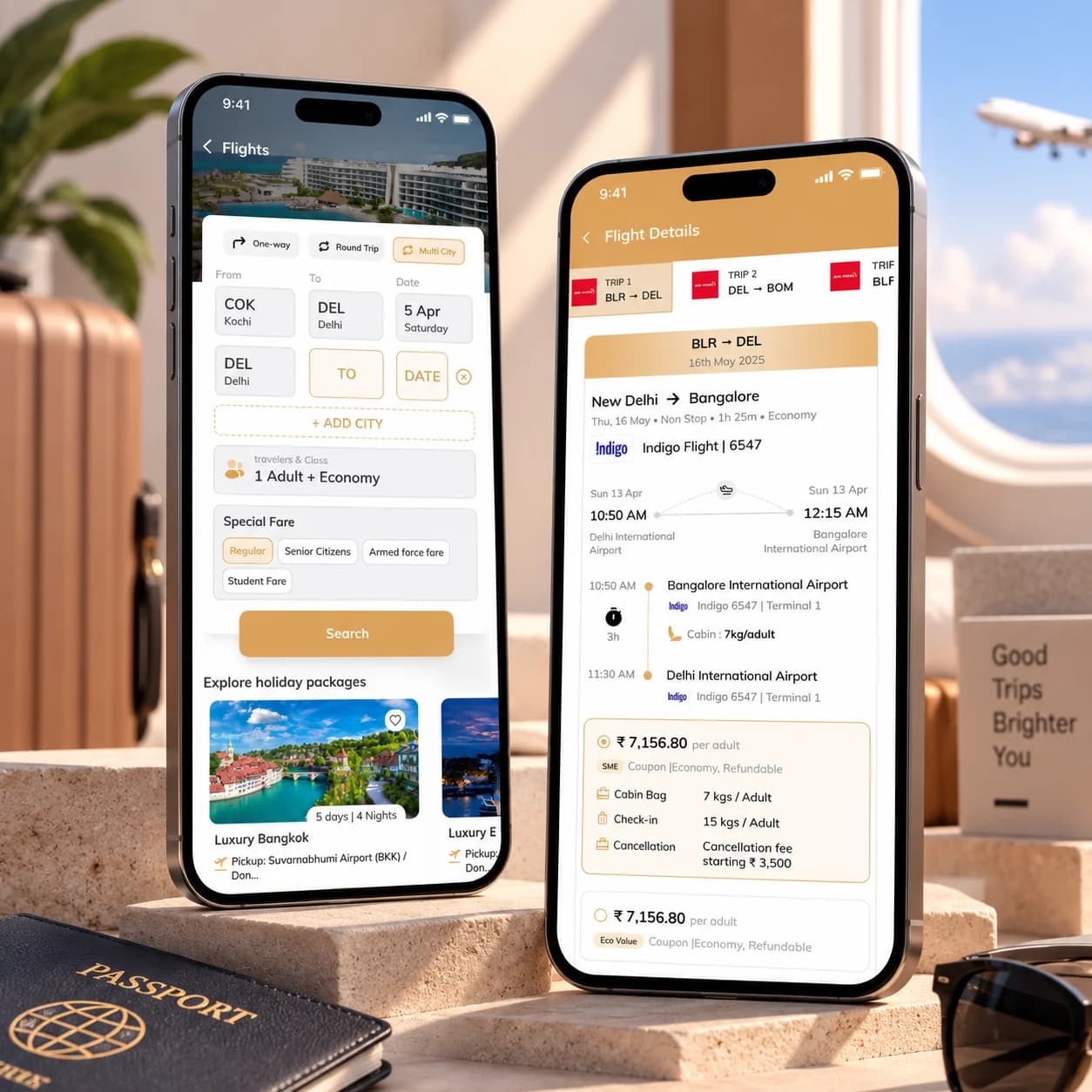
Flights have different trip types, dates, travellers, fare types and preferences.
Hotels introduce another set of decisions: destination, dates, rooms, guests, pricing, location and policies.
And behind those customer-facing experiences sits an operational layer that needs to manage users, bookings, packages and other travel activity.
The challenge was to make all of this feel like one coherent product, rather than a collection of disconnected tools.
The complexity was unavoidable. The confusion wasn't.
03 — The shift
So instead of designing one experience, we designed around different roles.
Flyden
Customer side
Discover and book
Operations
Run the business
Flights
Hotels
Holidays
Users
Bookings
Analytics
The product needed to feel familiar whether someone was searching for a weekend trip or managing travel operations.
That meant separating what the user needs to accomplish from everything the platform is capable of doing.
The traveller shouldn't need to understand the operational system.
And the operational team shouldn't be restricted by the simplified customer experience.
So the product evolved into connected experiences:
Customer-facing experiences for discovering and booking travel.Operational experiences for managing the business behind those bookings.
04 — The system
One ecosystem, with the right experience for every role.
Flights
Trip type
One-way · Round trip · Multi-city
Search
Origin · Destination · Date · Travellers
Decision
Fare · Baggage · Cancellation · Price
Hotels
Discovery
Photos · Rating and reviews
Detail
Dates · Guests · Location
Decision
Cancellation policy · Price
Operations
The people
Users · Bookings
The catalogue
Packages · Departures
The business
Revenue · Operational data
the customer sees the trip — the team sees the operation behind it
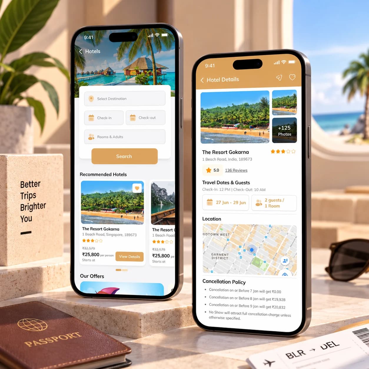
The customer-facing product brings multiple travel services into one place.
Flights, hotels, holidays, fixed departures and packages sit within the same ecosystem.
The flight experience supports different ways of travelling, including one-way, round-trip and multi-city journeys.
The hotel experience moves from discovery into detailed decision-making, bringing together photos, ratings, dates, guests, location and cancellation information.
And the operational side gives the internal team a completely different view of the same ecosystem.
05 — The decision
Complexity was unavoidable. We just had to decide where it belonged.
Search
Give me the basics
Results
Help me compare
Details
Help me decide
Book
Let me commit
One of the biggest design challenges in a travel product is information density.
A flight search can require:
- Where?
- When?
- How many people?
- Which trip type?
- Which fare?
But showing every possible option at once makes the experience harder to understand.
So the interface separates the experience into stages.
Don't make the user understand everything before they need to.
06 — The trade-off
We kept the power without putting everything on the screen.
- Too little informationLow confidence
- Too much informationHigh cognitive load
- The right information, at the right momentBetter decisions
Travel products have a natural tension:
More control can mean more complexity.Less information can mean less confidence.
So the interface needs to reveal complexity at the right moment.
For example, a user doesn't need to understand every flight rule while beginning a search. But once they are comparing options, details like price, baggage, cancellation, stops and fare type become important.
The same principle carries into hotels, where the experience moves from visual discovery toward detailed information such as reviews, location and cancellation policies.
07 — The result
From individual bookings to an operational travel system.
Flyden
Web
Discover and book
Mobile
Travel on the go
Admin
Run the platform
Flights
Hotels
Holidays
Bookings
The final product wasn't just a booking interface.
It became a connected ecosystem spanning:
3
platforms
Web application, mobile application and admin panel.
4
user roles
Travellers, agents, corporate teams and internal admins.
5
travel categories
Flights, hotels, holidays, fixed departures and packages.
08 — The reflection
The challenge wasn't fitting more features in. It was knowing what each person needed to see.
Flyden reminded me that complexity isn't always something a designer can remove.
Sometimes the product genuinely has a lot going on.
The job is to decide where that complexity belongs.
A traveller doesn't need the same interface as an operations team.A booking screen doesn't need to expose the entire system behind it.And a powerful product doesn't have to feel complicated.
Good UX isn't about hiding complexity.
It's about giving people only the complexity they need, when they need it.
Comment
Suhail
Throw me the messy one. Those are the good ones.